4 Common Fitness Website Mistakes (and How to Fix Them!)
A well-designed website is crucial for fitness studios and gyms looking to attract new clients and retain existing ones. Your website is often the first impression potential clients have of your business, and it needs to reflect professionalism, trustworthiness, and engagement. However, many fitness businesses make common mistakes that can negatively impact their success online.
In this blog, we’ll explore four common fitness website mistakes and how to fix them. By the end, you’ll know how to optimize your website to boost conversions, improve user experience, and enhance your brand.
1. Poor Mobile Responsiveness
The Problem:
With over 50% of web traffic coming from mobile devices, having a mobile-responsive website is no longer optional—it’s essential. A poor mobile experience can result in high bounce rates, meaning users leave your website without taking any action. Unfortunately, many fitness websites fail to optimize their design for mobile users.
How to Fix It:
To make your fitness website mobile-friendly, you should:
- Choose a Responsive Design: Ensure your website uses a responsive design that automatically adjusts to fit different screen sizes. Most modern website builders (like WordPress, Wix, and Squarespace) offer mobile-responsive templates.
- Test Mobile Usability: Regularly test your website on different devices (smartphones and tablets) to check for functionality. Tools like Google’s Mobile-Friendly Test can help you spot areas for improvement.
- Optimize Images and Videos: Large files can slow down your site on mobile devices. Compress images and videos to ensure faster loading times.
- A seamless mobile experience will encourage users to explore your site further and improve conversion rates.

2. Lack of Clear Calls-to-Action (CTAs)
The Problem:
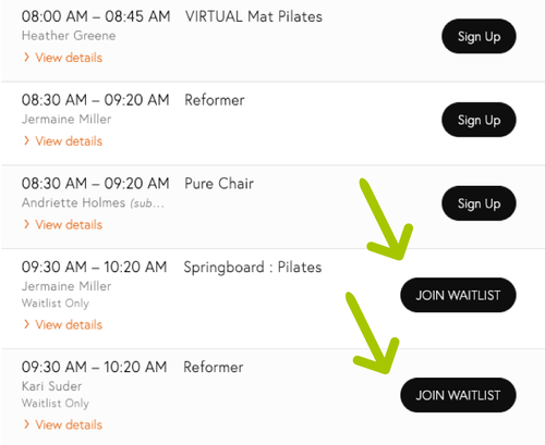
Many fitness websites fail to include clear and compelling calls-to-action (CTAs), leaving visitors unsure of what to do next. Whether it’s signing up for a free trial, scheduling a consultation, or subscribing to your newsletter, without a CTA, users won’t know what step to take, and you’ll miss out on valuable leads.
How to Fix It:
To create effective CTAs:
- Use Action-Oriented Language: Phrases like “Join Now,” “Get Started Today,” or “Book Your Free Class” are clear and encourage users to take immediate action.
- Place CTAs Strategically: CTAs should be placed where they are most likely to grab attention, such as at the top of the homepage, in the middle of blog posts, or at the end of your services pages.
- Create a Sense of Urgency: Using words like “Limited Time Offer” or “Only a Few Spots Left” can motivate users to act quickly.
-
Having clear, strong CTAs helps guide visitors through your website and increases the chances of conversions.

3. Slow Page Load Times
The Problem:
Slow websites frustrate users and can lead to a significant drop in traffic and conversions. Studies show that a one-second delay in page load time can result in a 7% reduction in conversions. Many fitness websites suffer from slow load times due to large images, unoptimized code, and lack of caching.
How to Fix It:
To speed up your website:
- Optimize Images: Use compressed formats (like JPEG or WebP) and avoid uploading high-resolution images that aren’t necessary.
- Leverage Browser Caching: Browser caching allows certain elements of your website to be stored locally on users’ devices, reducing the load time for repeat visitors.
- Use a Content Delivery Network (CDN): A CDN speeds up your website by storing copies of it in servers around the world. This reduces the time it takes to load for users far from your website’s main server.
-
By improving your site’s speed, you enhance user experience and help your website rank higher on search engines like Google.

4. Unclear or Overwhelming Navigation
The Problem:
Your website’s navigation plays a crucial role in how easily visitors can find the information they’re looking for. Fitness websites that have cluttered, confusing, or overly complex menus tend to frustrate users and increase bounce rates.
How to Fix It:
Simplifying your navigation ensures a smoother user experience:
Limit Menu Options: Avoid overloading your menu with too many links. Instead, focus on the essential pages like “Home,” “About,” “Classes,” “Blog,” and “Contact.”
-
- Use Descriptive Labels: Your menu labels should be clear and descriptive. Instead of vague titles like “Programs,” opt for something more specific like “Fitness Classes” or “Yoga Sessions.”
- Add a Search Function: For larger websites, adding a search bar can help users quickly find the information they need without scrolling through multiple pages.
- Streamlined navigation not only improves usability but also enhances SEO by making it easier for search engines to crawl and index your pages.

Final Thoughts: Improving Your Fitness Website
In today’s competitive fitness industry, your website is one of your most valuable assets. However, making common mistakes like poor mobile responsiveness, unclear CTAs, slow loading times, and complex navigation can hurt your chances of converting visitors into paying customers.
By addressing these issues and optimizing your site, you’ll create a better user experience that not only attracts more traffic but also keeps visitors engaged and leads to higher conversions. Start with these four common mistakes and work towards making your fitness website an effective tool for growing your business.
Remember, your website is more than just a digital presence—it’s a powerful marketing tool that can set you apart from the competition.


